Bumble Accessibility Redesign
Dating apps ask you to say hello before a clock runs out. We asked what that does to autistic users, then redesigned two features.
- Role
- Lead UX Researcher and Designer
- Team
- Alyssa Ramirez, Emma James, Andrea Manreza, Erika Hallquist
- Timeline
- Six weeks, Summer 2026, ART 567 Inclusive Design, CSUN
- Status
- Complete (course project). Self-audited. Testing with autistic users is the next step.
- Methods
- Heuristic evaluation (Nielsen and WCAG), competitive analysis, persona, user flow, prototype, self-audit
- Tools
- Figma, Figma Make, Google Slides
This was a self-audit, not a usability study. We checked our work against heuristics and WCAG. We have not watched autistic users try it, so we can’t say the redesign works yet. That’s the next step. Bumble has also changed some features since our audit (before August 7, 2026). This is an independent student project and is not affiliated with Bumble.
The question
How does Bumble’s 24-hour match expiration window, with no free way to extend it, affect autistic users trying to start a conversation? Starting a conversation is already a high-stakes task, and a hard clock forces a decision before someone has had time to process how to respond.
My part: I was lead researcher and designer on a team of four with Emma James, Andrea Manreza and Erika Hallquist.
Hinge and Tinder have no match timer. Bumble chose one.
From our competitive analysis of Bumble, Hinge and Tinder.
What the audit found
We evaluated the app against Nielsen’s ten heuristics and WCAG, and gave every barrier a severity rating.
| Barrier | Heuristic | Severity | WCAG |
|---|---|---|---|
| 24-hour match expiration | 3, User control and freedom | 3, Major | 2.2.1 Timing Adjustable (A) |
| Accidental left swipe with no undo. The fix is behind a paywall. | 3, User control and freedom | 3, Major | 2.5.2 Pointer Cancellation (A) |
| Messaging works differently for heterosexual and queer matches | 4, Consistency and standards | 3, Major | 3.2.4 Consistent Identification (AA) |
| Language with no clear definition (“something casual,” “life partner,” “socially” vs. “frequently”) | 2, Match between system and real world | 3, Major | 3.1.3 Unusual Words (AAA) |
| Busy screens with no way to change the display | 8, Aesthetic and minimalist design | 3, Major | 1.4.8 Visual Presentation (AAA) |
| No read receipts | 1, Visibility of system status | 2, Minor | 4.1.3 Status Messages (AA) |
From barrier to decision
Our persona, Sam, helped us test each choice. She is 25, a graphic designer with level 1 autism, who struggles with time blindness and gets anxious when rushed. Sam is a persona, not a participant.
| The problem | What Sam needs | What we built |
|---|---|---|
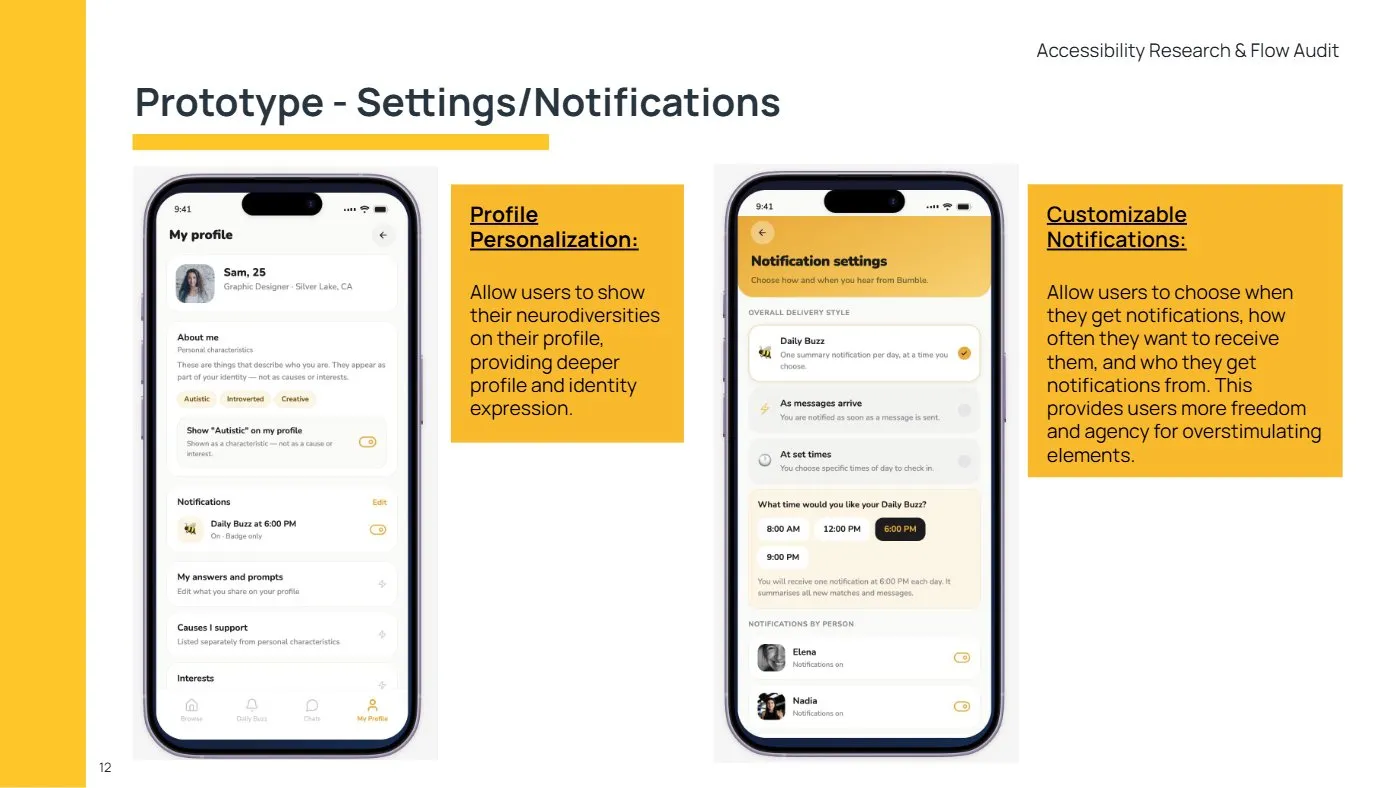
| The 24-hour timer starts the moment you match, and there is no free way to extend it. Design decision | One predictable check-in, with a clear view of what is about to expire. | Daily Buzz: one daily summary of new matches, messages and expiring windows. |
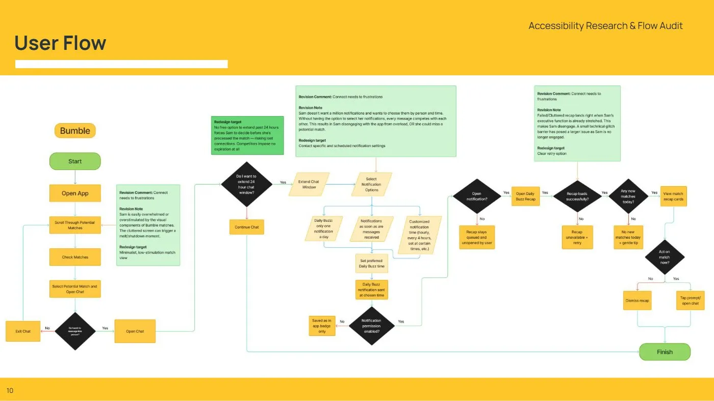
| Constant notifications overwhelm Sam, and Bumble lists neurodiversity under "causes I support." Design decision | Control over when, how often and from whom she hears, and a way to describe herself on her own terms. | Settings: custom notifications by time, frequency and person, plus an option to show neurodiversity as a profile characteristic. |
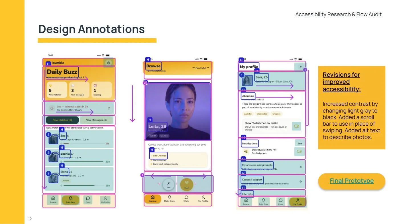
| Our own self-audit found low-contrast gray text, a swipe-only action, and photos with no description. Design decision | Text she can read, a way to act without swiping, and photos a screen reader can describe. | Black text, a scrollable alternative to swiping, and alt text on every photo. |
Process notes
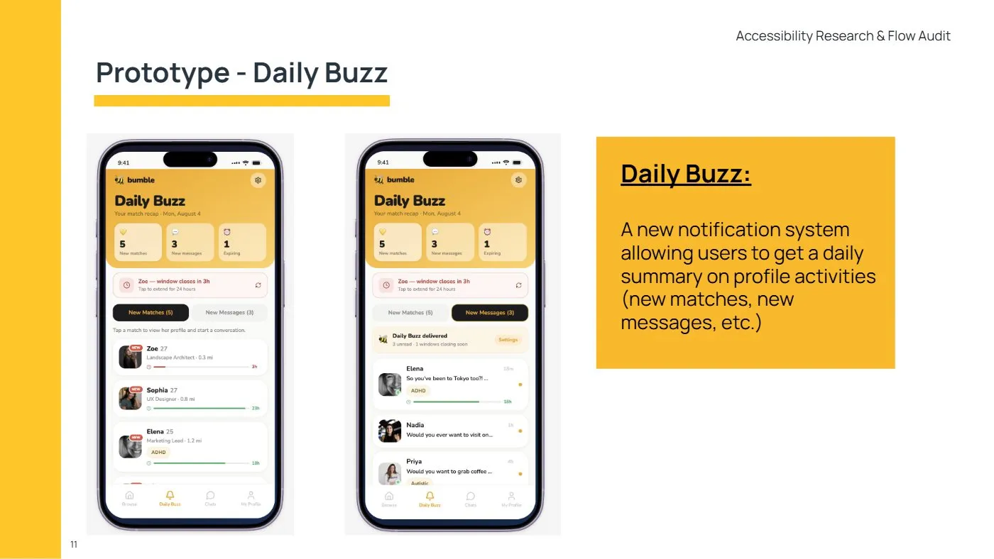
Sam’s flow through the app
Sam wants a long-term relationship and wants to feel understood. She takes things literally, misses innuendo and is easily overwhelmed by busy screens. We mapped her path from matching to messaging and found where the clock pressed hardest.
What the self-audit caught, and how we used AI
We ran the prototype through Figma’s accessibility checks and reviewed it against WCAG ourselves. That found three gaps, and we fixed them.
We used Figma Make to build prototypes quickly, which left more time for strategy. It needed several prompts for some changes and handled color contrast poorly, so the accessibility checks had to catch what it got wrong.
What accessibility taught me
Accessibility checks at the end found three problems, and each would have been cheaper to avoid with an accessibility lens on from the first sketch. It’s the order of operations I’d change first next time.