Frolic
A CareerFoundry project from 2024. It shows my planning and competitor research from earlier in my training.
- Role
- Solo UX designer
- Team
- Solo project
- Timeline
- UX Immersion, CareerFoundry, completed 2024
- Status
- Complete (certificate project, 2024). Research planning and competitive analysis shown here.
- Methods
- Competitive analysis (Flo, MyChart), SWOT, marketing review, problem statement, user stories, survey and interview plans
Early work, planning stage. I drafted a survey and a 16-question interview guide, and wrote user stories, but I don’t have results, personas, wireframes or a prototype to show. For my stronger research, see Inclusive Play and Bumble.
The brief and my focus
CareerFoundry asked for a responsive health and wellbeing portal, designed mobile first and with inclusion in mind. I focused on hormonal and reproductive health. My problem statement: people need a reliable way to monitor their hormonal and reproductive health, and a supportive tool that keeps them informed as they go through changes.
What I found, and the risks I saw
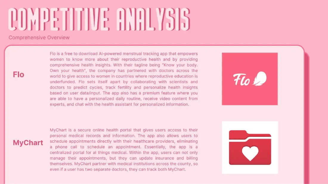
I compared Flo, a menstrual and fertility tracker, with MyChart, a patient portal tied to medical providers. Nearly all of Flo’s standout features sit behind a paywall, and both apps raise privacy questions. I thought MyChart’s text felt small and crowded on mobile, and that Frolic could help by explaining medical terms in plain language.
| The risk I saw | What it needs | My idea |
|---|---|---|
| Health details are sensitive, and people may hesitate to put them in an online profile. Hypothesis | Enough trust to share them. | Explain the privacy policy plainly and let users customize their privacy settings. |
| So many features could make the app cluttered and hard to navigate. Hypothesis | Easy navigation. | Group related topics into sections and add a short tutorial in onboarding. |
| If people stop using a health app, it fails. Hypothesis | A reason to come back. | Habit tracking with rewards, community groups and notifications people can customize. |
| Scheduling with doctors needs agreements with medical offices and systems that connect. Hypothesis | Offices willing to partner. | Offer offices an incentive to collaborate. |
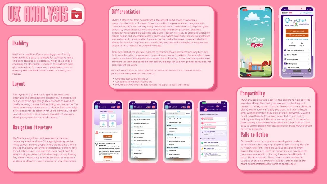
Constraints. This was a course project with no participants and no real client. I list the risks I saw (privacy, a cluttered interface, doctor integration, engagement and personalization) with a possible answer to each, but none of it has been tested.